How to Write Compelling Software Release Announcements
A release announcement showcases how the user’s experience is better today than it was yesterday. That sounds obvious, but most release announcements seem to forget that there’s a user at all.
So many release announcements just enumerate new features in a way that’s totallly divorced from how real people use the software. The announcement is essentially just a changelog with better writing.
For example, here’s a “changelog” style of announcing a new feature:
- Added “repeat” button to the event menu.
Don’t just tell the user that there’s a new button. Tell the user what they can do with that button.
Create recurring events automatically🔗
In previous versions, the only way you could create weekly or monthly events was to duplicate events manually for every occurence. Duplicating events this way was tedious and error-prone.
Our latest release allows you to create recurring events automatically. Click “Options > Repeat”, and you’ll find options to repeat on any schedule you want. You can even sync with your company’s holiday schedule to automatically skip dates that fall on a holiday.
Note that the example doesn’t boast about what the software can do. It tells the user what they can do with the software. It speaks directly to the user, describing what happens when “you” create events.
Release notes are not release announcements🔗
Some software companies dump their commit history into a document, add some headings, and call that a release announcement.
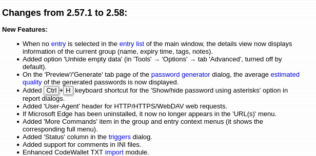
Not a release announcement
That is not a release announcement. Those are release notes.
Release notes are fine and practical, but they’re boring.
You can publish release notes as well, but if you want users to feel excited about your newest release, give them something more interesting to read than a sterile changelog.
What to feature in a release announcement🔗
A release announcement is a summary of the changes that will have the greatest impact on the user’s experience. It presents them in a clear, accessible way that focuses on the user.
In contrast to release notes, which aim to be exhaustive, release announcements include only the most impactful changes.
To decide which features to include in the release announcement, consider these questions:
- What can the user do in the latest version that they couldn’t before?
- Which workflows became easier?
- Which workflows became faster?
Notice that the questions don’t include, “Which feature took the longest to complete” or “What feature contains the cleverest algorithm?”
I’ve published releases where the flagship feature was a performance improvement that only took a few hours of dev work. Implementation cost doesn’t always correlate with end-user value.
Call it “faster” not “less slow”🔗
Some bugs are so frustrating and time-consuming to fix that you forget why you’re even fixing them in the first place. When it comes time to write the release announcement, you’ve forgotten how the bug impacted the user experience and just report that it’s gone:
Fixed a thread deadlock that froze the UI for up to two second when creating a new file.
Focus on the improvement rather than the flaw. Instead of declaring the absence of a bug, celebrate how you improved the user’s experience:
We sped up new file creation, so you can now create a new file in under 20ms, a 100x speedup from v1.2.
Briefly introduce your product🔗
In addition to building loyalty with existing users, a release announcement should pique the interest of new, potential users.
If you publish your release announcement to the web, many of the people who read it will have never heard of your product at all.
I’m excited to announce the 1.0 release of OpenVQ9! After 17 years of hard work, this release is a triumph for all OpenVQ9 fans, as well as the loyal developers in the OpenVQ9 ecosystem (all of whom know what OpenVQ9 is, so there’s no need to explain it here).
Early in your announcement, include a quick explanation of what your product does. If the reader isn’t familiar with your product, what’s the least they need to know to understand the rest of your announcement?
I’m excited to announce the 1.0 release of OpenVQ9, the fully open and customizable software for robot vaccum cleaners.
Don’t alienate your existing users with a 20-paragraph introduction to a product they already know. A sentence or two will provide context for new users without boring your existing users.
Make the most of your screenshots🔗
Screenshots liven up a release announcement and make it easier for users to understand new features.
Make screenshots so obvious that the reader recognizes what you want them to see without reading the surrounding text or zooming in. Use cropping, highlighting, or arrows to direct the reader’s attention.
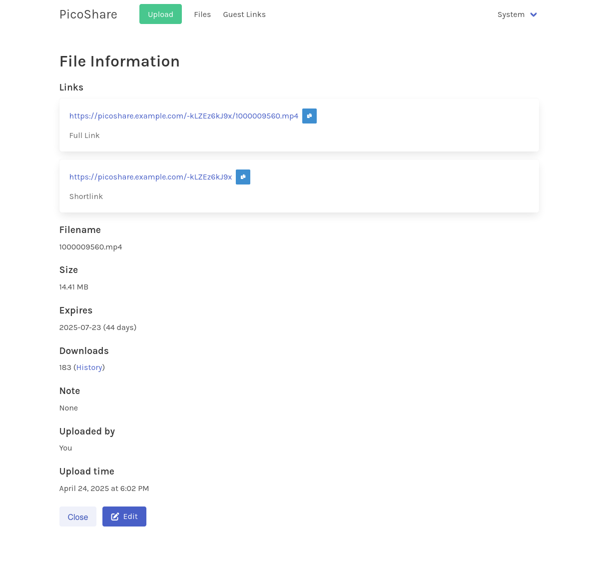
The above screenshot fails to direct the reader’s attention. There are so many UI elements in the screenshot, and none of them have focus.

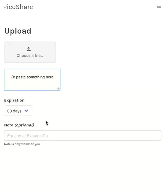
The second screenshot draws the reader’s focus more clearly by using a tighter crop and adding an arrow to identify the relevant part of the UI.
Keep animated demos short and sweet🔗
Good news: modern browsers support media formats for playing high-quality screen recordings. We’re long past the days of washed-out, pixellated GIFs and clunky YouTube embeds.
- Animated images: WebP and AVIF image formats can show GIF-like animated images, and they enjoy wide browser support.
- Embedded videos: H.264 and WebM-encoded videos play natively in the browser with a simple
<video>tag. No third-party client library required.
Aim to keep demos under five seconds. 15 seconds should be the maximum. This is both for the sake of respecting the reader’s time and your server’s bandwidth. Nobody wants to sit through a two-minute video about a dialog box.
This 9-second demo is only 852 KB as a WebP file or 100 KB as an H.264-encoded video.
Turn your numbers into graphs🔗
One of my favorite open-source projects recently announced a major performance improvement. Here’s how they shared the news with their users:
Benchmark 1 (6 runs): test-old
  measurement          mean ± σ            min … max      delta
  wall_time           918ms ± 32.8ms     892ms …  984ms   0%
  peak_rss            214MB ±  629KB     213MB …  215MB   0%
  cpu_cycles         4.53G  ± 12.7M     4.52G  … 4.55G    0%
  instructions       8.50G  ± 3.27M     8.50G  … 8.51G    0%
  cache_references    356M  ± 1.52M      355M  …  359M    0%
  cache_misses       75.6M  ±  290K     75.3M  … 76.1M    0%
  branch_misses      42.5M  ± 49.2K     42.4M  … 42.5M    0%
Benchmark 2 (19 runs): test-new
  measurement          mean ± σ            min … max      delta
  wall_time           275ms ± 4.94ms     268ms …  283ms   ⚡- 70.1% ±  1.7%
  peak_rss            137MB ±  677KB     135MB …  138MB   ⚡- 36.2% ±  0.3%
  cpu_cycles         1.57G  ± 9.60M     1.56G  … 1.59G    ⚡- 65.2% ±  0.2%
  instructions       3.21G  ±  126K     3.21G  … 3.21G    ⚡- 62.2% ±  0.0%
  cache_references    112M  ±  758K      110M  …  113M    ⚡- 68.7% ±  0.3%
  cache_misses       10.5M  ±  102K     10.4M  … 10.8M    ⚡- 86.1% ±  0.2%
  branch_misses      9.22M  ± 52.0K     9.14M  … 9.31M    ⚡- 78.3% ±  0.1%
If you frequently use the hyperfine benchmarking tool, this output format is intelligible to you. To anyone else, it’s a barf of confusing numbers. Which of these numbers is supposed to be important? Are these numbers good or bad?
Your users are not performance experts. Instead of dumping a bunch of numbers on their heads, present the information in a graph so that the message is clear and unambiguous.

Plan your release announcement during development🔗
At my last company, I was in charge of both release planning and release announcements.
I once dedicated an entire release to overhauling our product’s self-update feature. The previous logic was so messy that it took five months to replace it, twice the turnaround of our typical release.
When I finally wrote the release announcement, I realized I’d screwed up: nothing in the release benefitted our users. Sure, future releases would be faster and less error-prone, but the user’s experience today was no better than it was yesterday.
I awkwardly tried to explain to our users why we made them wait five months for a release that essentially did nothing for them. I promised that they’d benefit from these changes soon, as the new update system would accelerate development (and it did), but I was embarrassed that the release primarily made life better for our developers rather than for our users.
From then on, I always considered the release announcement early in release planning. Given the tasks I planned for a sprint, I identified the ones that would be exciting and valuable enough to the user to include in the release announcement. By planning the announcement early, I thankfully avoided ever writing another uncomfortable explanation of a release that offers nothing to the user.
No more “various improvements and bugfixes”🔗
A release announcement should never include the phrase, “various improvements and bugfixes.” You might as well boast that the team proudly breathed air throughout development and used the latest version of the Internet.
If you can’t articulate how a change benefits your users, don’t highlight it in your release announcement. Save the exhaustive list of changes for your release notes, but even there, please leave out “various improvements and bugfixes.”
Real-world examples of compelling release announcements🔗
Gleam JavaScript gets 30% faster🔗
The release announcement for Gleam 1.11 puts the flagship feature right in the title: a 30% performance improvement. The title makes it crystal clear that the announcement focuses on what the user cares about. Rather than just throwing numbers at the reader, the author visualizes the improvements with clear graphs.
The Gleam release announcement describes every feature in terms of user impact. Rather than bore the reader with a dry list of changes, the announcement accompanies every change with code snippets showing how each change in the language and toolset has made life better for Gleam’s users.
Navigating UI3: Figma’s new UI🔗
Figma is a design tool that earned a strong reputation for its relentless focus on user experience. This same focus is evident in their release announcements.
Figma’s UI3 release announcement focuses on empowering the user. You won’t find anything like, “this button is now here, and we added this dialog.” Instead, they tell the user “You can now do X to achieve Y.” That is, instead of explaining what changed, they showcase how the change benefits the user.
My only criticism is that Figma’s release announcement bizarrely uses 8 MB GIFs (yes, multiple) to show 5-second demo animations.
Summary🔗
- Highlight new features and changes that excite the user.
- The exhaustive accounting of every change belongs in the release notes, not the release announcement.
- Describe changes in terms of what improved rather than what is no longer bad.
- Include a succinct introduction of your product in case the reader hasn’t used it yet.
- Use screenshots that make the new feature obvious even if the reader doesn’t zoom in or read the surrounding text.
- Include animated demos, but keep them under 15 seconds.
- Prefer graphs to raw numbers.
- Cut out vague descriptions like “various improvements and bugfixes.”
Revisions🔗
I’m writing this book iteratively based on reader feedback. I’ve listed significant changes below.
- 2025-06-25: Published original version
- 2025-06-25: Added section, “Briefly introduce your product”
- 2025-06-25: Revised examples for “Call it ‘faster’ not ’less slow’” and the intro section
- 2025-07-01: Added section, “Turn your numbers into graphs”
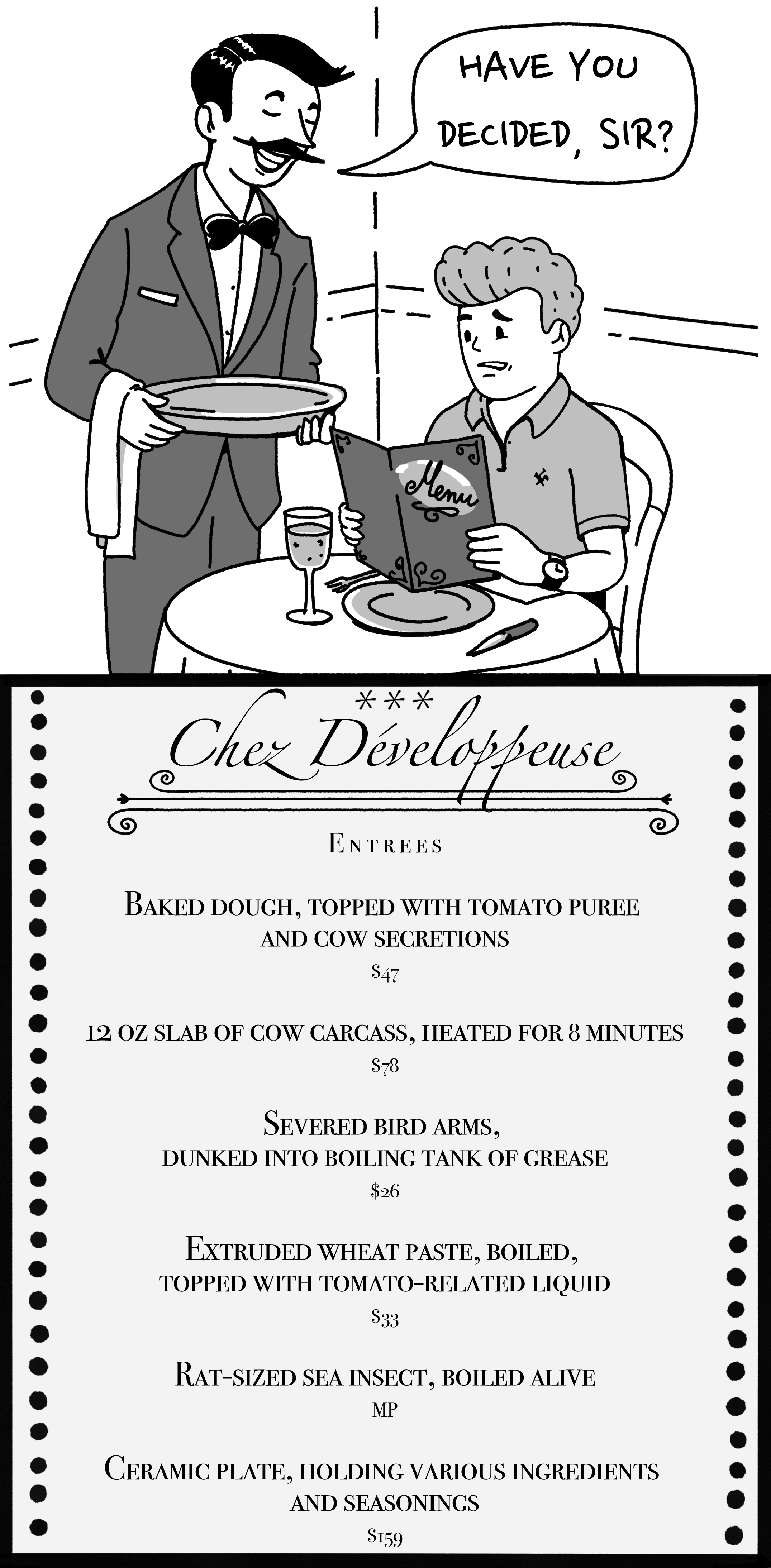
“Chez Développeuse” illustration by Piotr Letachowicz.
